Silo
A clickable and adaptable menu
The beer menu is built automatically by looking for those available on tap in the sheets.
Each beer is clickable and leads to its product sheet.
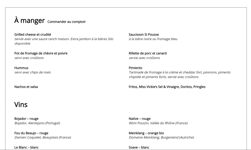
As for the regular menu, it is possible to separate the items into sections with a subtitle, and to give each item a title and a description.
Must-see features
Always floating, a clock icon lets you know when entering the site or at any time if the brewery is open. The tab includes a link to the Contact page with the full schedule.
Whether the beers are available on tap or in cans or whether they were only ephemeral, each beer is represented in the product grid and has a complete sheet. Enough to satisfy curious amateurs.
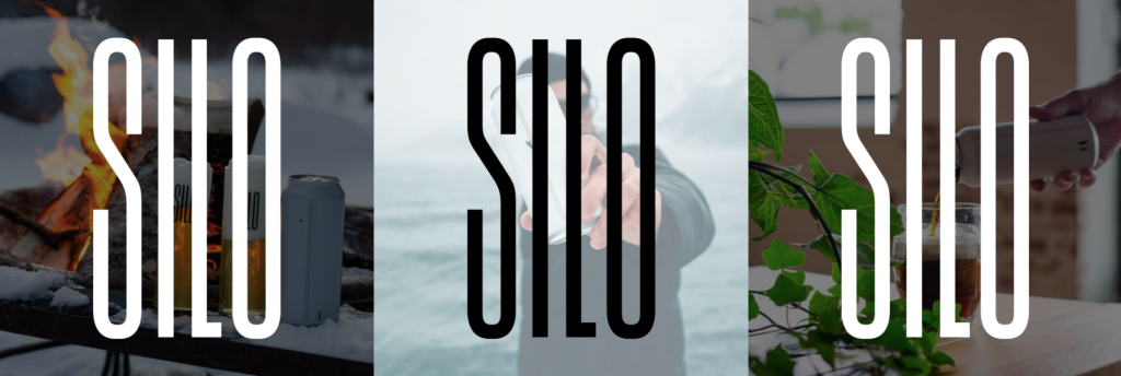
Seeing graphic elements of the logo created by the designer of Silo, La Matryoshka decided to take inspiration from these elements to create a banner on the home page and a footer worthy of the name.
A hybrid colloquium
MATAsud is the project of Florence and Mathieu, respectively assistant professor in religious studies at the Faculty of Theology and Religious Studies and professor in the Department of Religious Studies at UQAM. They have set up a hybrid symposium (presential and via Zoom) requiring a request to participate from interested parties.
We have therefore integrated forms for registering for the symposium, as well as for proposing questions to be asked at the round table. Registrants will receive, before the symposium, the links to the various Zoom sessions.
A colorful style guide
A programmed colored background, vibrant colors and a classic font. South Asia is represented in several elements.
Must-see features
As some elements were not translated and not to lose in the visual, we decided to opt for a multilingual site where the content in French would preside, while leaving room for content in English, smaller.
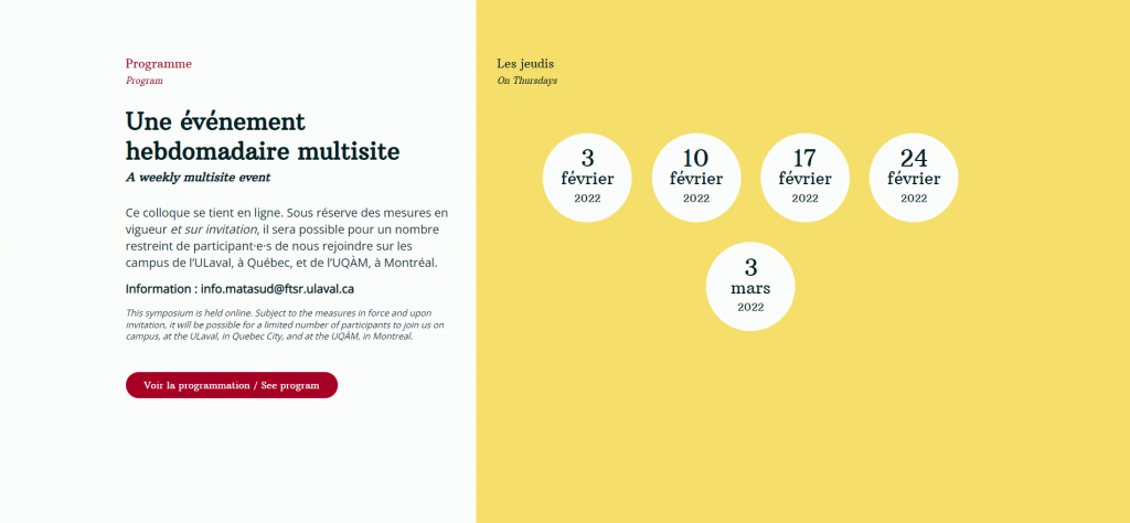
As the symposium is held on 5 different non-consecutive days, we had to find a way to display all the information for all the days in the least amount of space possible, while keeping an attractive and easy-to-use visual. La Matryoshka opted for a carousel with accordions presenting the summaries of each session.
Services performed
In 2019, La Succursale contacted La Matryoshka to rework its very dated website.
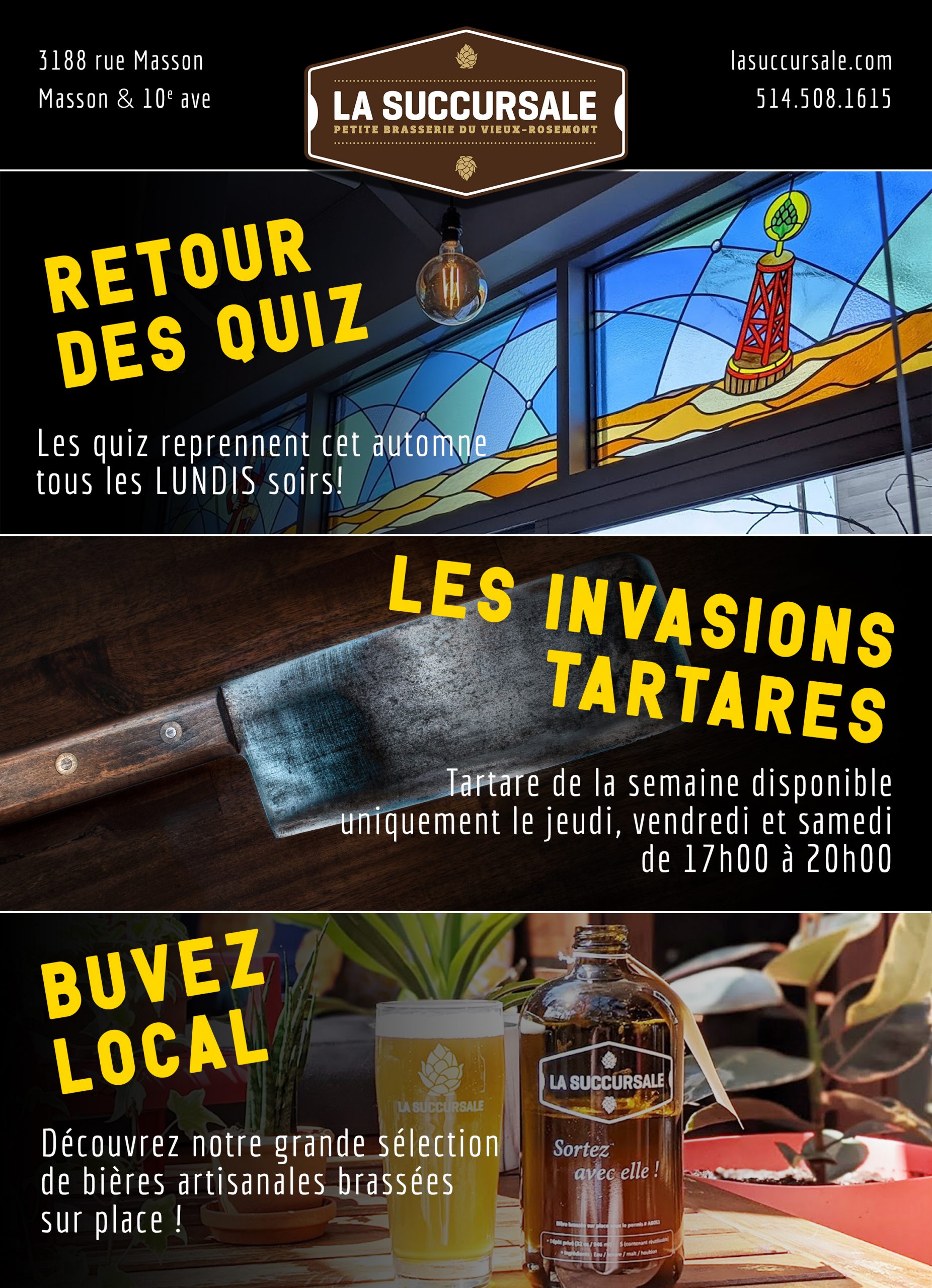
The site has been rebuilt as a one-pager with popups for each of the 6 sections. The owners of the neighborhood microbrewery could easily modify the availability of beers online.
In 2020, we decided to make the jump to a Facebook-only page. The URL www.lasuccursale.com has a redirect leading to it.
La Matryoshka has become the community manager of La Succursale, taking care of updating information on Facebook, making a calendar of publications and publishing them, reviving the Instagram account and increasing its reach, etc. .
Incidentally, I also found myself managing La Succursale’s Google account (Maps, Business, etc.).
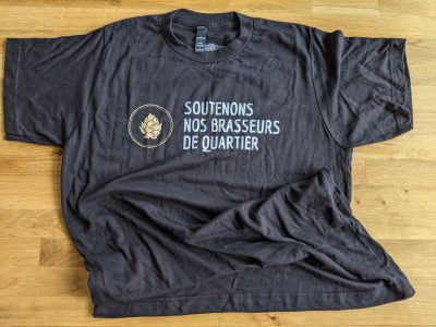
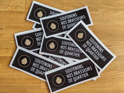
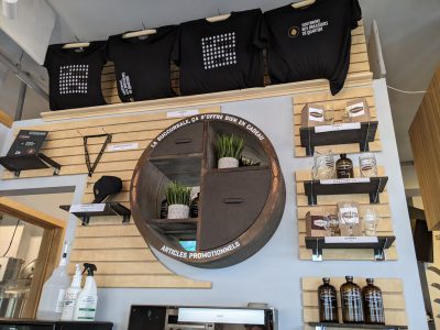
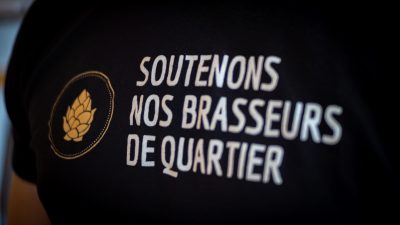
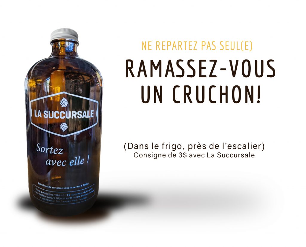
Already selling glassware, La Succursale wanted to offer t-shirts, caps, tights and thongs. The Matryoshka creates the designs and takes care of finding a supplier. Merchandise increases seasonally.
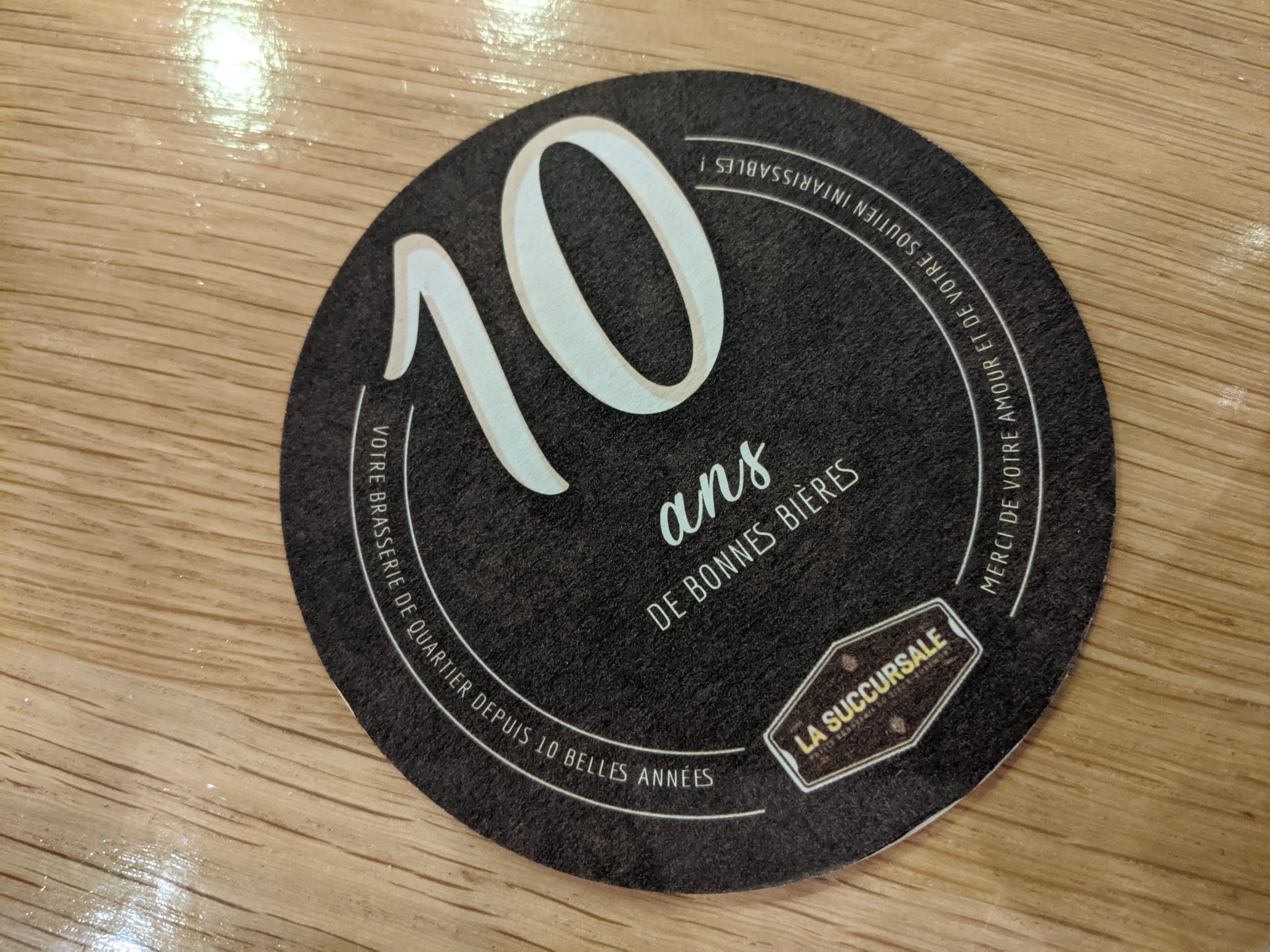
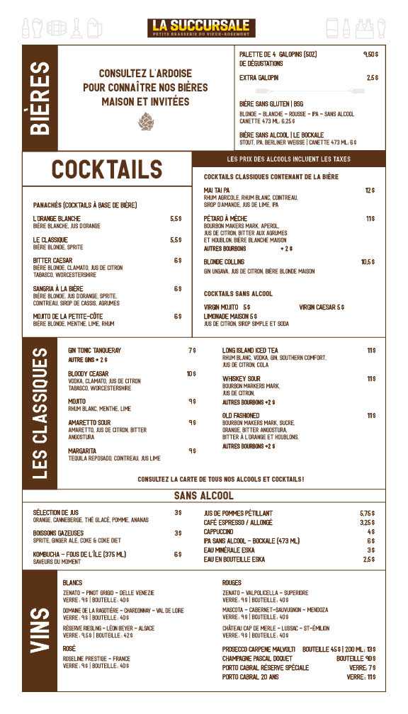
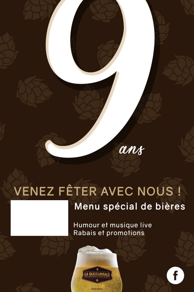
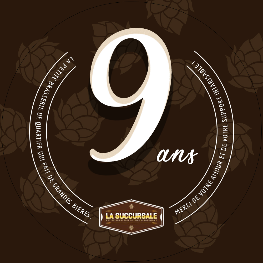
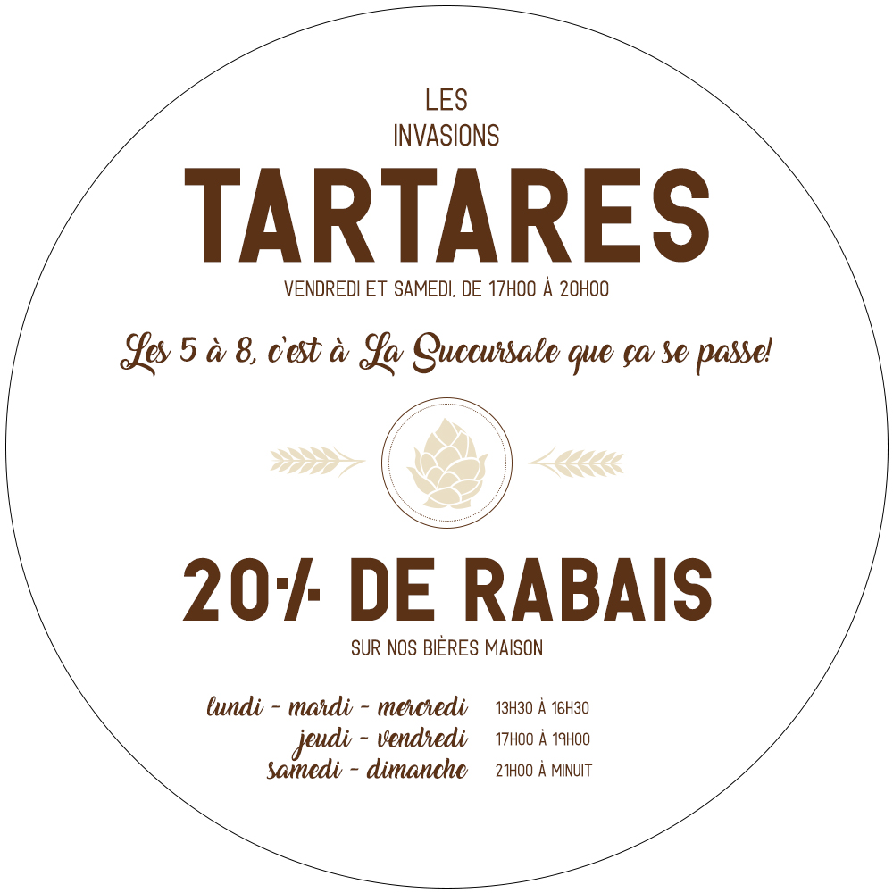
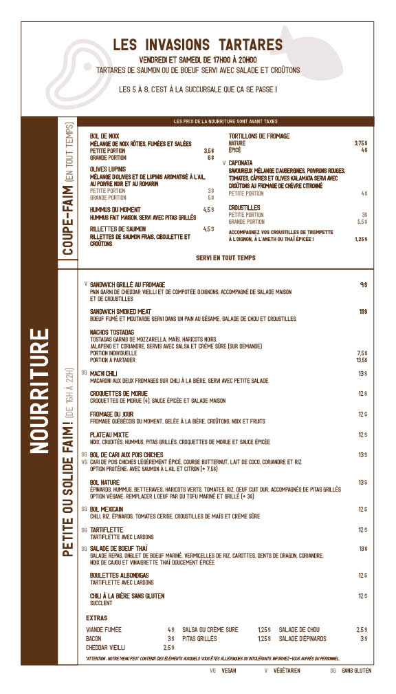
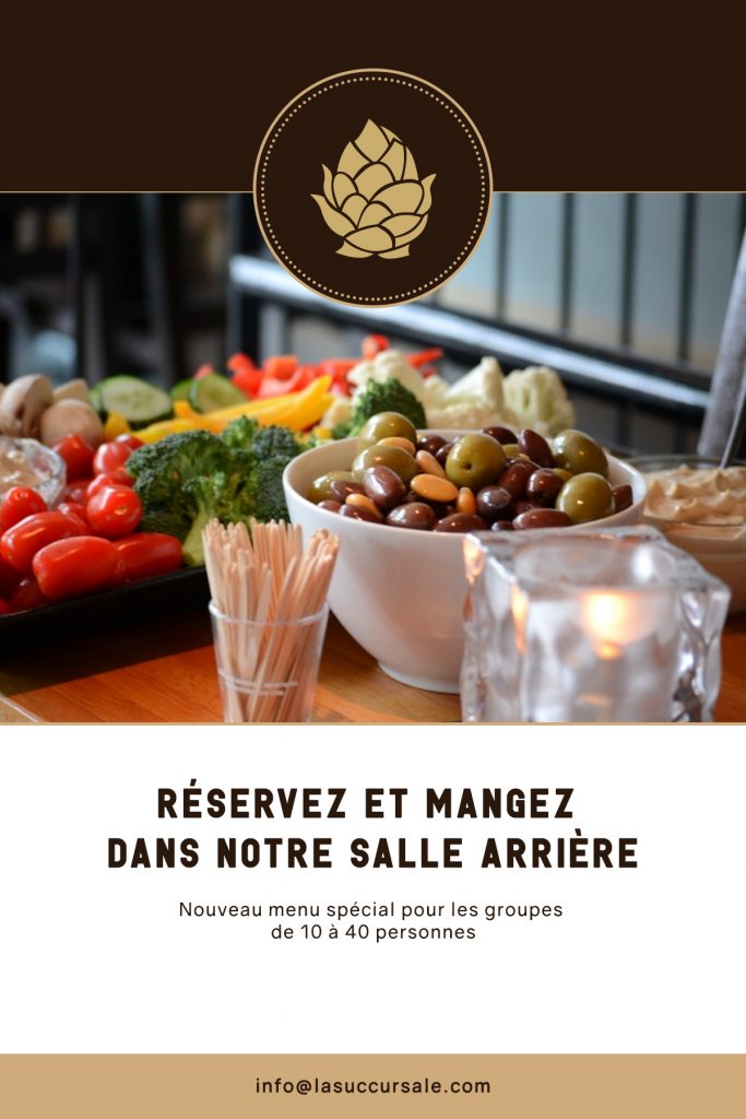
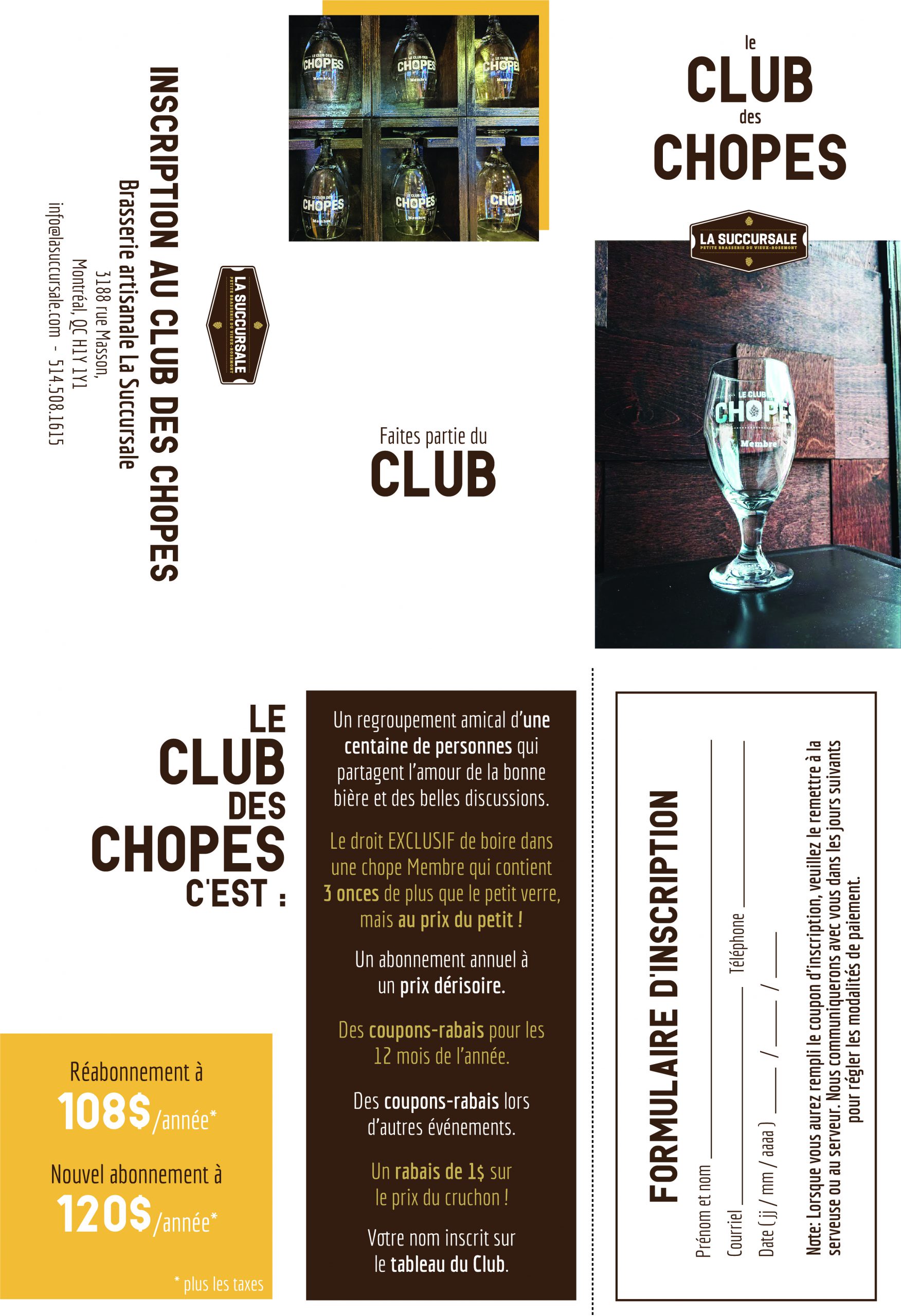
Coasters, posters, Morris columns, menus, leaflets, etc. La Matryoshka is in charge of creating all the printed visuals. Morris columns can be found in two places on Masson Street.
When the client wishes to hire new staff, he contacts La Matryoshka to take care of creating job offers on the various channels.
Site redesign
The initial goal of the collaboration between La Succursale and La Matryoshka was to redesign the website to eliminate all unnecessary and expired elements, and to rework the visual style of the neighborhood microbrewery. We came to a site architecture with 6 sections: Beers, Food, Rental Room, Mug Club, Sunday Quiz, and Contact Information.
We wanted everything to fit on a single page (the viewport). As I myself am a fan of microbrewery beers, and I often look while on the road for the opening hours and the phone number, I knew full well that this information is crucial on mobile (and desktop), it that’s why I integrated a small widget allowing to determine at the time of the visit on the site if the brewery is open or not.
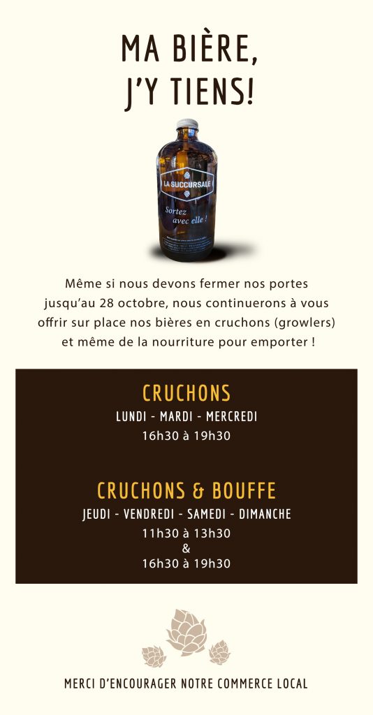
The site was perfect, but the problem was this: The owners of La Succursale had decided to eliminate their UnTappd subscription, because the account of efforts requested daily edits to update their beer list was too high. But a list was still on the site to let customers know which beers were coming and which were available. The WordPress platform requires identification and it is much easier to modify the content of the site on a computer or a laptop than on their mobile – that they have faster access – which is why after talking with customers, we decided to opt for the improvement of their business profile on Facebook, and the possible temporary elimination of their website.
Social media management
With 5.49 million Quebecers on Facebook, reaching customers via social media seems appropriate. However, the brewery page was far from being optimal and above all from being up to date. We have therefore worked hard on the information available (opening hours, description, menus, etc.).
I also provided training on the types of posts, the types of photos that attract reactions, and we also worked on the tone.
Merchandise


Prints
By reinventing their food menu, often modifying their beers and adding the whole Covid situation, the artisanal brewery La Succursale needed a lot of printing. Table ads, menus, posters, coasters, and more were created for La Succursale.
What a framework
It was La Cursive that brought its own mega-colored model. The elements had been thought out, it only needed to be programmed! Being copywriters, Marie-Sarah and Ricardo arrived with punchy and complete texts. It was a quick job, well done!
The site was created on WordPress with a custom theme. It contains a blog and is bilingual.
Must-see features
All the superb visual of the site is based on the smooth animation of the scroll and the movement of the elements present on the page. It was made using the Locomotive Mtl framework.
In the footer, we have integrated a bank of words of the day, in English and in French, which change daily and which can be adapted to the calendar. Everything is functional thanks to a system of cookies.